
My Role
Solo designer, working directly with stakeholders and development partner from discovery through pilot launch. I owned everything from research and strategy to final design.
Problem I Was Solving
EzyVet handled operations well, but caregivers had no practical way to access their own pet’s information. The portal was hard to set up, mobile experience was poor, and staff were manually absorbing the gap for every records question, invoice, and appointment reminder.
Challenges
EzyVet’s API was a mixed bag — some endpoints were clean, others returned raw data that needed additional scripting before it was even designable. Appointment booking was technically supported but operationally impossible, so the right call was knowing when to stop pushing and design clearly within the constraint.
Outcomes
CareTrack is in pilot and formal metrics are still coming in. The qualitative signal was immediate though, stakeholders saw how much manual intake work could simply disappear. The QR code onboarding flow turned a friction-heavy process into scan, confirm, done.
Overcoming people service gaps in pet medicine
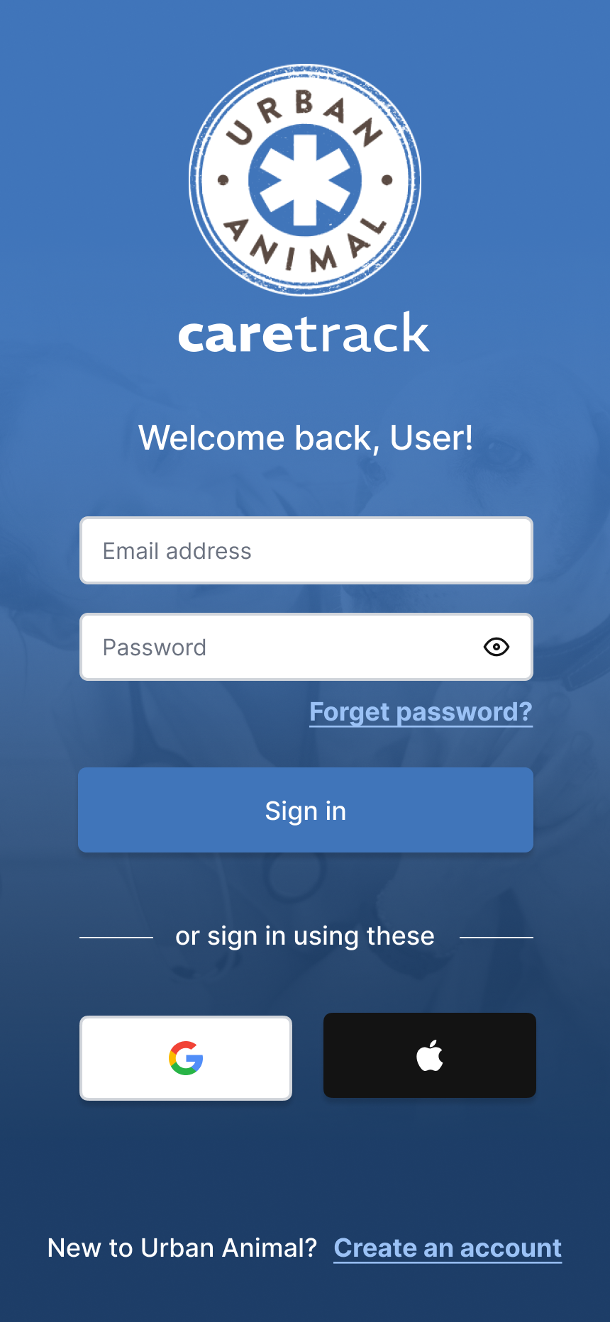
The challenge was familiar: a capable back-office system nobody was actually using. Urban Animal ran on EzyVet, but its interface wasn’t built for caregivers, the web portal didn’t work well on mobile, and account setup friction meant most new patients never bothered. Staff absorbed the gap. CareTrack would be built to close it.
Project overview
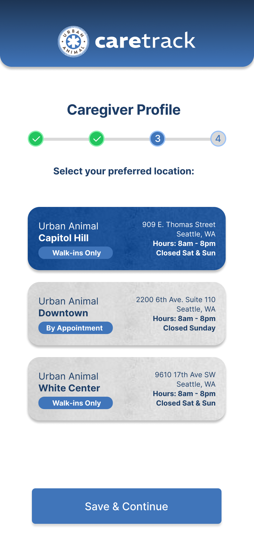
Urban Animal is a Seattle-based veterinary practice with three locations. They had the technology — EzyVet handled their back office well. The problem was the last mile: getting caregivers to actually use it. Intake was still largely manual, the portal was underused, and there was no mobile presence between visits.
My job was to design CareTrack from scratch — a native mobile app that surfaced EzyVet’s data in a way caregivers actually wanted to use, handled onboarding for new and existing patients, and gave Urban Animal a foundation to build on. I was the only designer, working directly with stakeholders and developers to navigate what EzyVet’s API could and couldn’t do.
Discovery
Before opening Figma, I spent time at the clinics — watching how staff handled check-ins, how caregivers moved through intake, where the handoffs broke down. Stakeholder interviews and caregiver conversations filled in the rest.
The pattern was clear: staff were the middlemen for everything. Records questions, invoice confusion, appointment reminders — EzyVet held all of it, but caregivers had no practical way to get to it themselves. The portal setup was too hard. Mobile experience was poor. Most new patients never made it through.
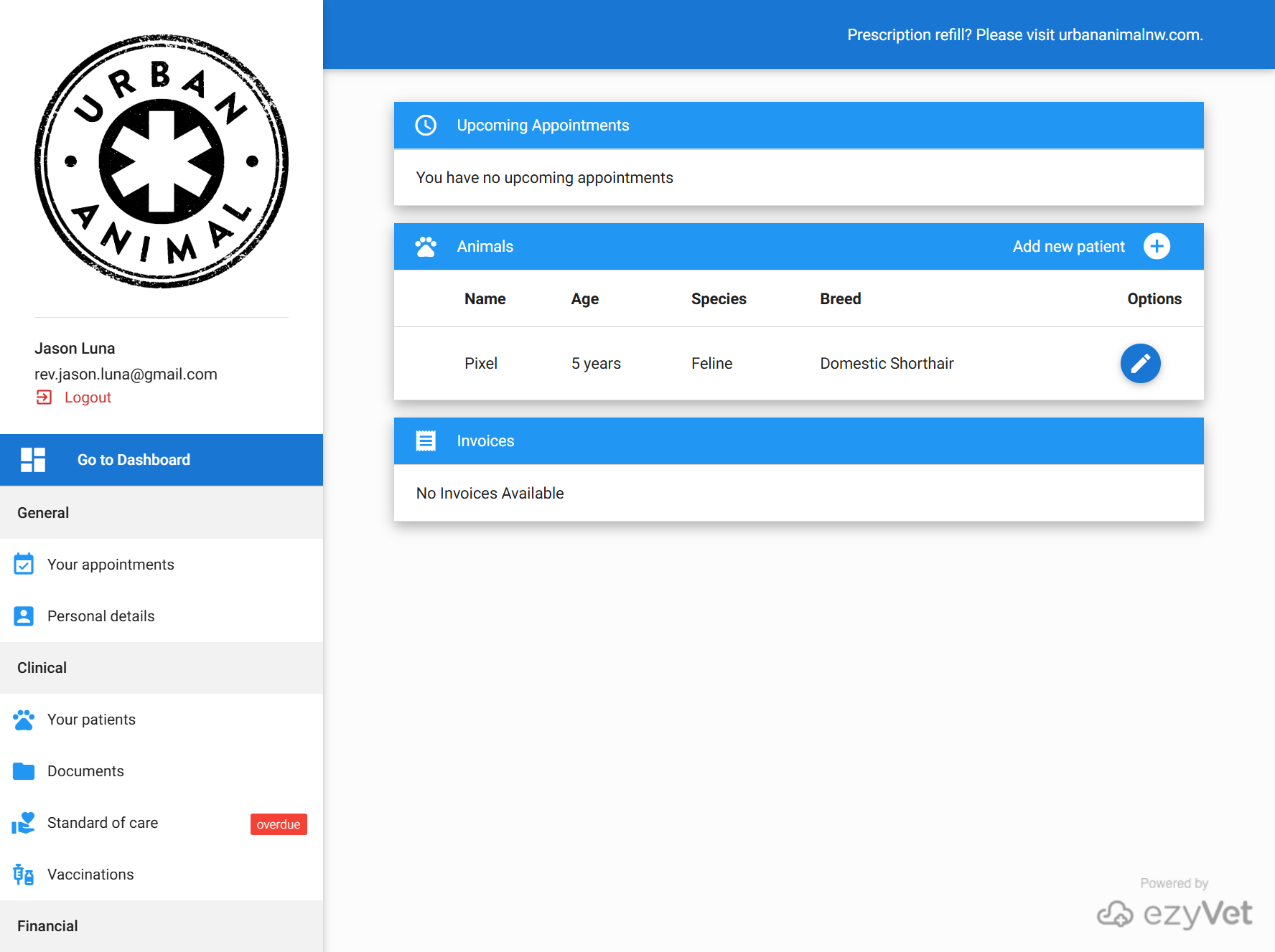
The research pointed toward a clear strategic direction: the app needed to make EzyVet invisible. Caregivers shouldn’t have to think about the system underneath – they should just see their pet’s appointments, their vet’s reminders, their invoices, their documents, in one place that felt native to how they already used their phone.
Design process
EzyVet’s API gave me access to appointments, caregiver profiles, patient records, documents, standard of care communications, vaccinations, and invoices. Every feature made it into the pilot – but none were straightforward.
The API was a mixed bag. Some endpoints were clean. Others returned raw JSON that needed additional scripting to become designable. I was often designing for data structure rather than simplicity. The end result was a good compromise, but it was earned.
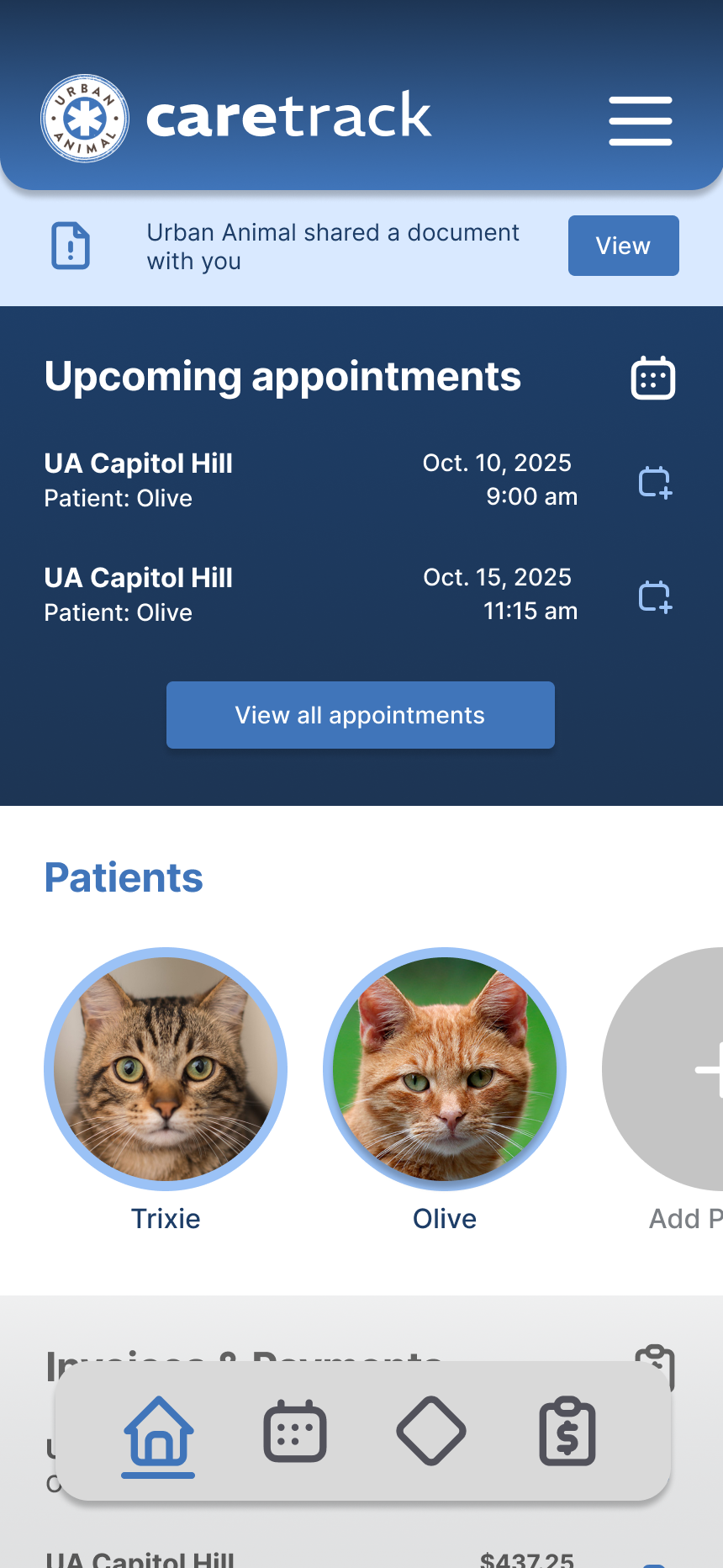
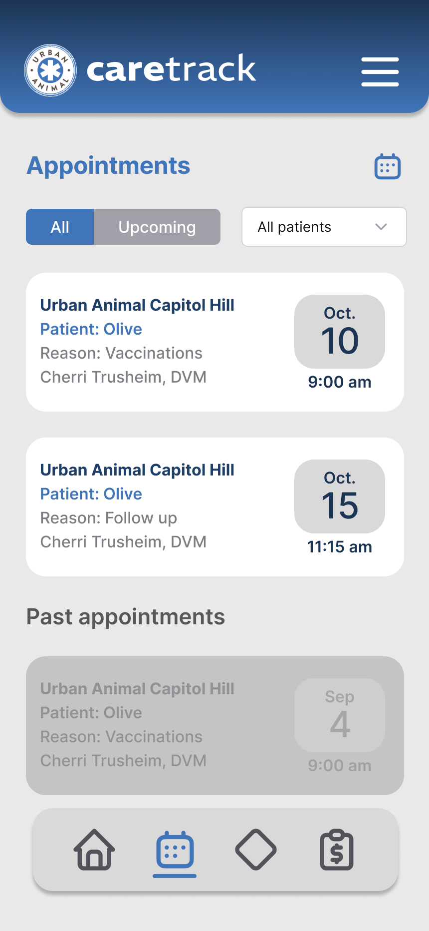
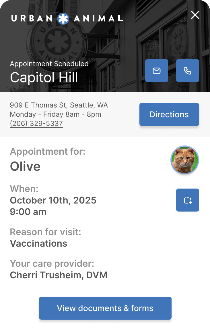
Appointment booking was the clearest constraint. EzyVet supported it technically, but Urban Animal scheduled through a separate service and created appointments in EzyVet manually afterward. In-app booking wasn’t feasible. After exploring workarounds, the right call was a clean read-only appointments view with calendar sync. Sometimes the best design decision is knowing when to stop pushing and design clearly within the constraint.
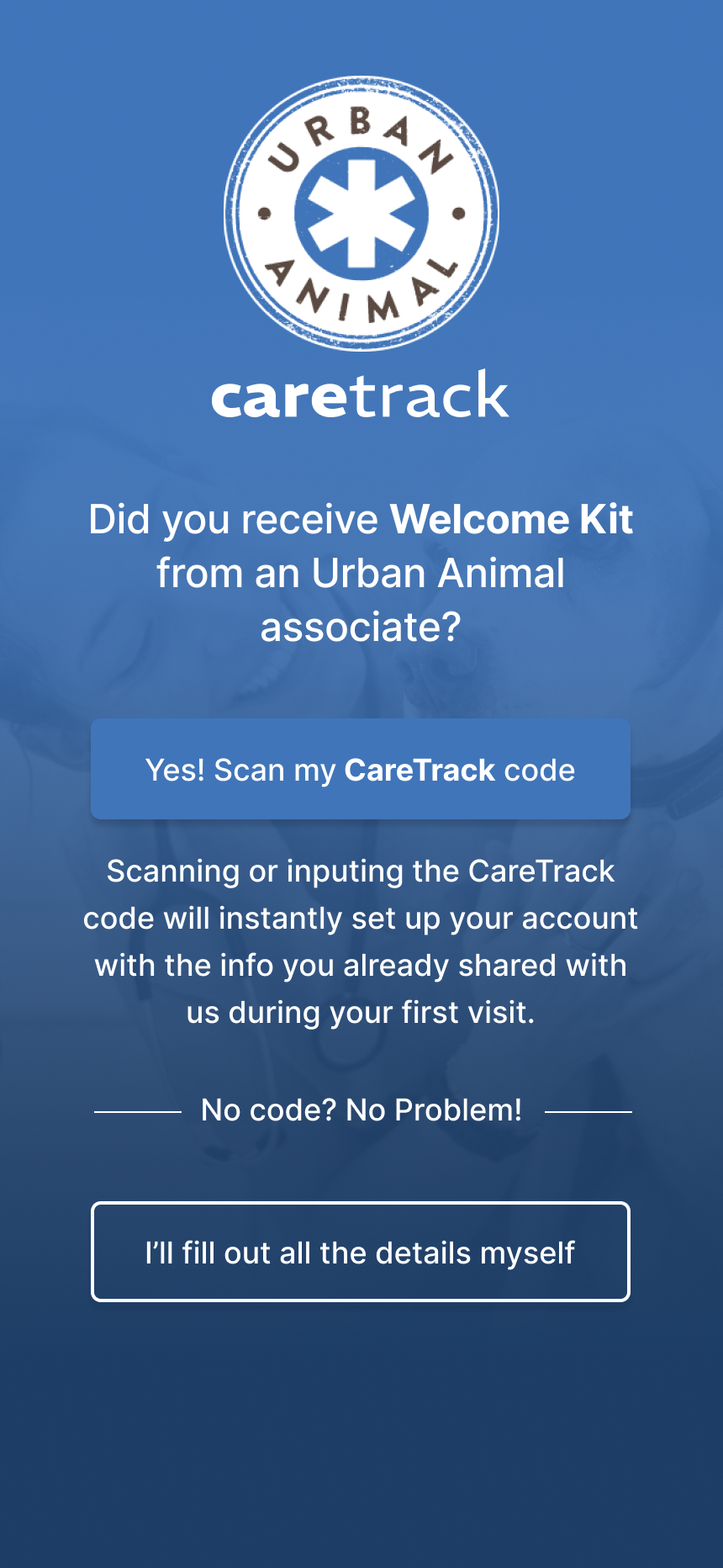
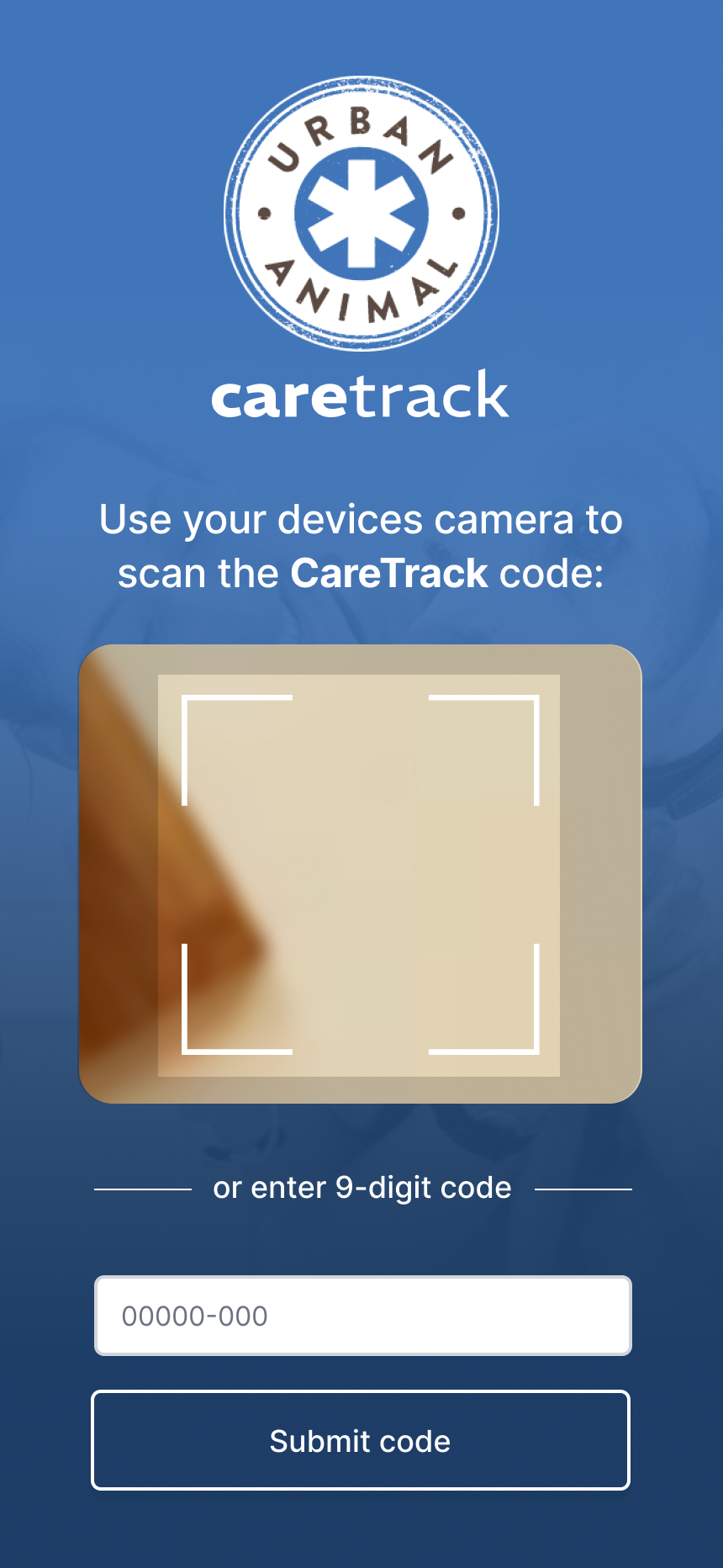
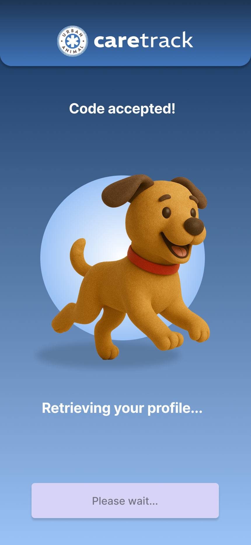
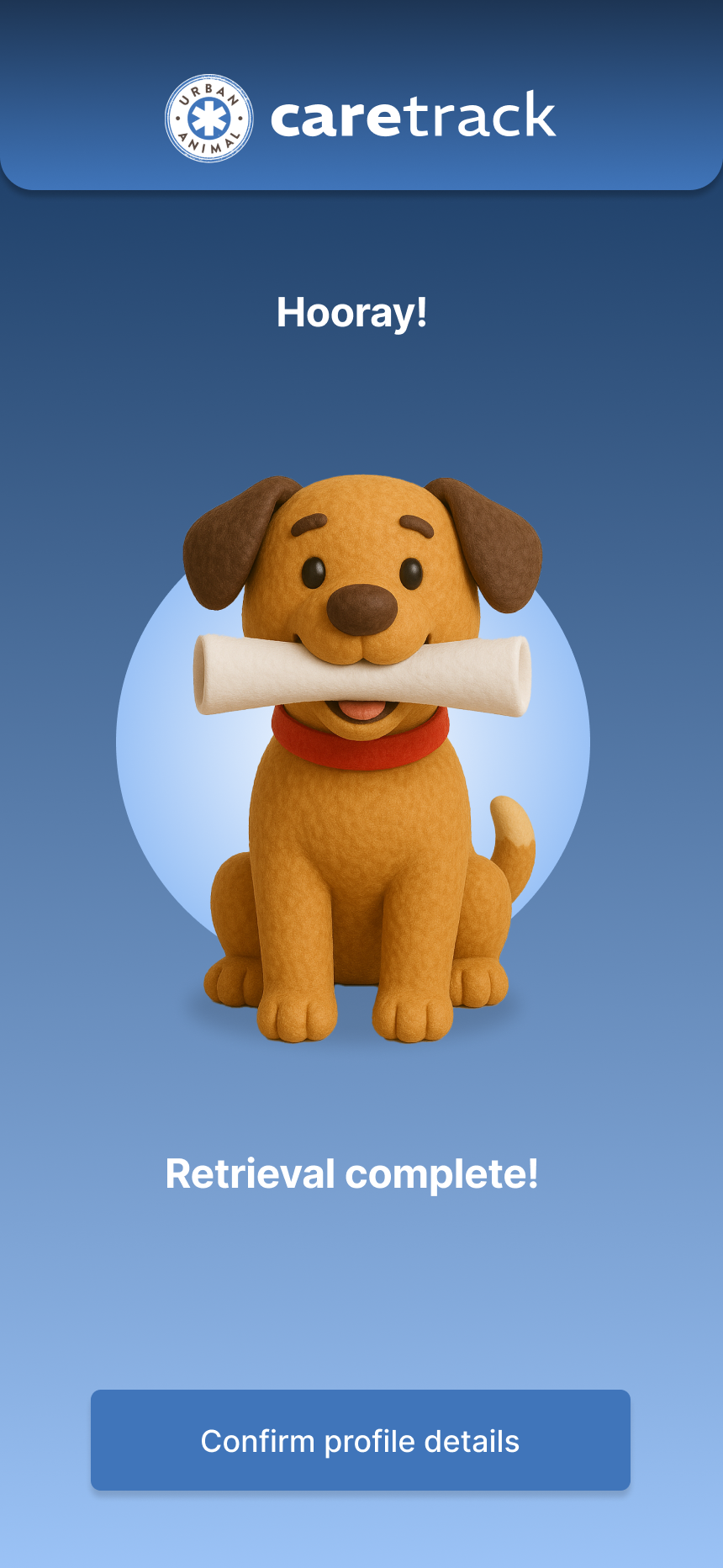
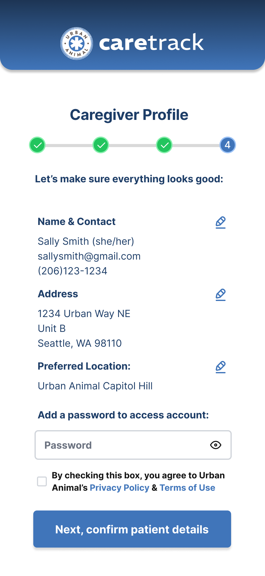
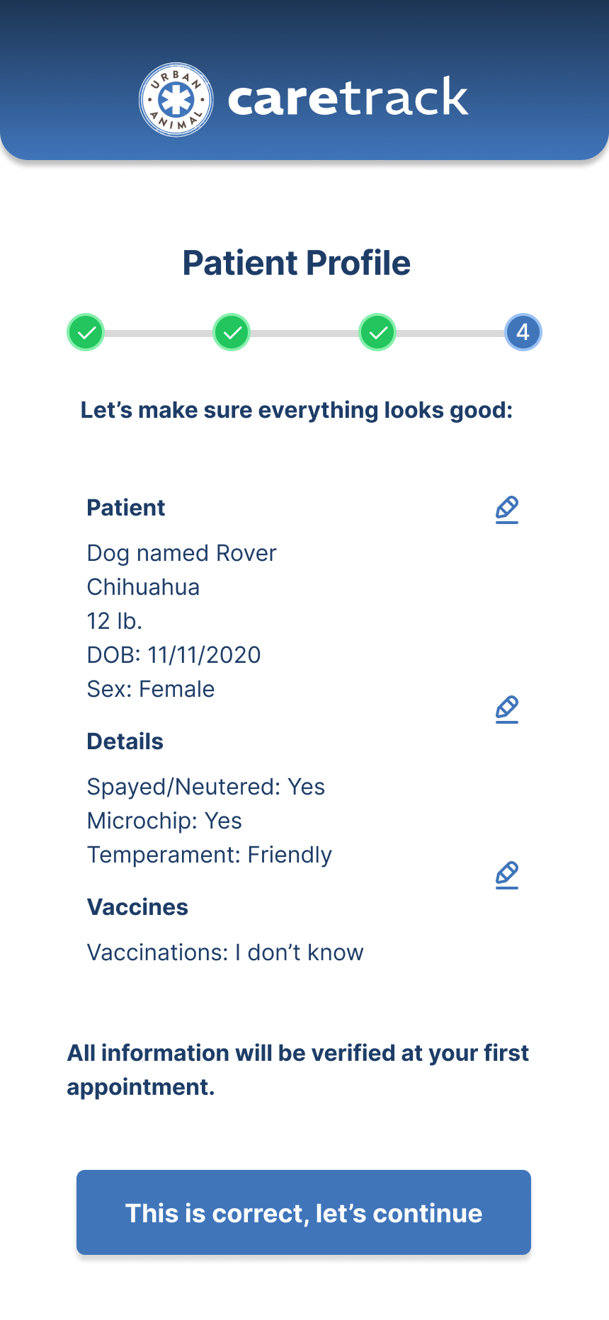
The onboarding flow was where I invested the most strategic energy. The QR code solution came from a simple question: what’s the absolute minimum a caregiver should have to do to get into this app? For new patients, scanning a QR code at check-in would trigger app download, account creation, and EzyVet profile setup in a single flow – eliminating the manual data entry staff had been absorbing. For existing patients, it linked their EzyVet account to CareTrack without requiring them to navigate the web portal. The flow was designed to work across the full range of tech-comfort levels. If you could scan a code, you were in.
Final design
CareTrack launched into pilot covering every major caregiver touchpoint: onboarding, appointments, patient records, vaccinations, documents, standard of care, and invoices. The breadth was intentional – a complete replacement for what staff had been manually managing, not a lightweight companion app.
Impact
CareTrack is in pilot, so metrics are still coming. But the qualitative signal was immediate. Stakeholders saw how much manual intake work could simply go away. The QR onboarding flow landed as an obvious solution to a problem everyone had quietly accepted as normal.
When I walked Urban Animal’s stakeholders through early prototypes, the reaction was relief. The QR code onboarding flow collapsed a drop-off-prone intake process into something almost invisible – scan, confirm, done. Staff saw how much manual data entry could disappear. Leadership saw a direct channel to caregivers they’d never had before.
The app also gave Urban Animal something new: a direct channel to caregivers. Push notifications, standard of care updates, document sharing — the foundation for marketing communications, health reminders, and more in future iterations. Built to be useful on day one and expandable from there.
Learnings
Small and mid-size businesses have enterprise-scale UX problems – they’re just less visible. EzyVet is a capable system. But capability doesn’t equal adoption, and a tool that staff operate on behalf of customers isn’t solving the problem it was bought to solve.
I also came away with a sharper instinct for designing within constraints. The appointment booking limitation was a good test, the right answer wasn’t a clever workaround, it was a clean solution that did exactly what it promised.
CareTrack worked because it made EzyVet disappear from the caregiver’s perspective. Find the friction, trace it to its root, remove it so cleanly that users never think about what was there before.
